Sector Geek
  • 🕸 Web dev
  • 📱Mobile dev
  • 🎨 Design
  • 🖲 Hardware
  • 🕹 Gaming

Bookmarks

You haven't yet saved any bookmarks. To bookmark a post, just click .

Menu

  • Home
  • Contact

Social

17 January 2019
Logo design

The new logo of Slack

The new logo of Slack

The Slack’s Design Team and the one of Pentagram worked together to show us a fresh look of Slack with a new logo.

The reason of this change was because the previous logo was created before the launch of the company and since there are 11 colours involve on it then it was very difficult to make combinations with backgrounds.

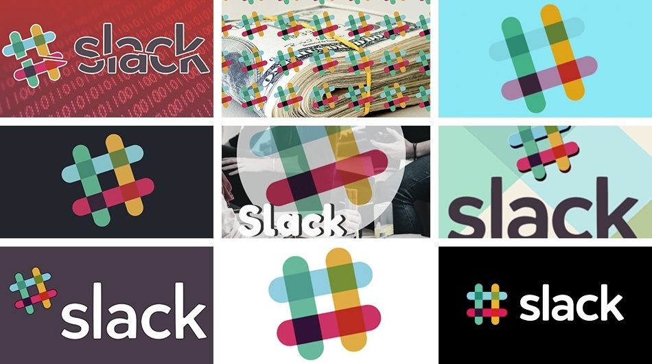
As you can see, there isn’t any good consistency at all.

So, if at some point you asked why we have different versions of the logo for the Slack app, the icon and the logo of the website, the reason is the mentioned above.

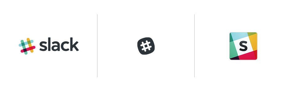
Here you can see the big difference between the old and the new logo for the different Slack environments.

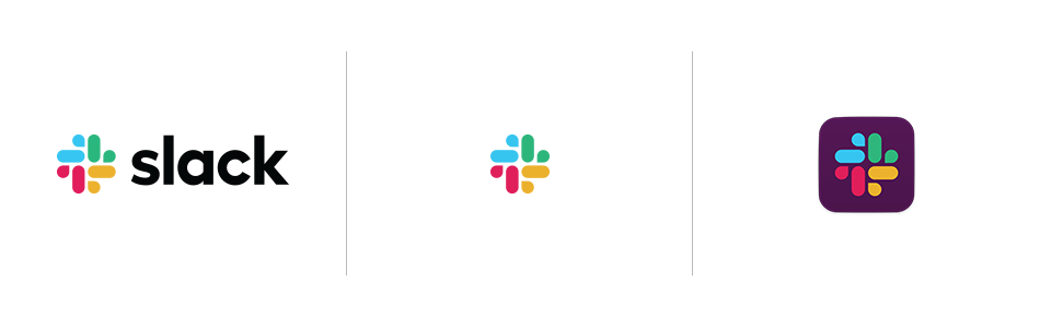
In my opinion, the new one looks awesome!

Original article

Logo design New logo Slack
Share


Share

Recent posts

Tech News

Zippyshare announces closure of the project after 17 years of service

21 March 2023
Web development

Exploring Mozilla Labs: Innovation and Experimentation with the Web

15 March 2023
Crypto

Exploring the different types of Crypto Wallets

11 March 2023
react.js

Getting started with ArcGIS SDK for JavaScript in React

01 March 2023

You might also like

Logo design

The new logo of Slack

17 January 2019

Copyright © 2023, Sector Geek. All Right Reserved.